
Best Custom Data Visualization Service Provider on the Globe
Seasoned Data Visualization Expert
We are experts in custom development and specialize in enhancing digital products with advanced data visualization.
- 0 +
- Years in Data
Visualization Market
- 0 +
- Data Visualization
Experts on Board
- 0 +
- Delivered
Projects


What Our Clients Say About Us

We recently collaborated with EezahTech for advanced data visualization needs, and their expertise in leveraging the D3 library has been nothing short of exceptional. Their team’s proficiency in creating innovative and interactive visualizations brought our data to life in ways that exceeded our expectations. The clarity and ingenuity of their work have not only enhanced our project’s value but also provided us with insights that were previously unattainable. EezahTech’s capability in this field is advanced, setting them apart as leaders in software development. We are immensely satisfied with the results and look forward to our continued partnership with EezahTech for future endeavors.

We have been collaborating with EezahTech for more than two years on various data visualization and data processing projects.
The team never failed to implement all what we ask for with exceptional results. The project manager at EezahTech
is always involved in understanding the details, managing the expectations reasonably, swift communication via
different means, and adjusting the plan to meet changing needs. Technical capability of the team in D3 and other
javascript libraries is advanced. We are satisfied with our partnership with EazahTech and look forward to have
more projects with them.
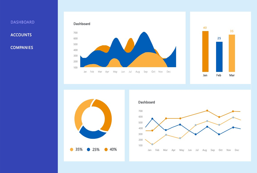
Visuals We Use In Data Visualization
 ×
×
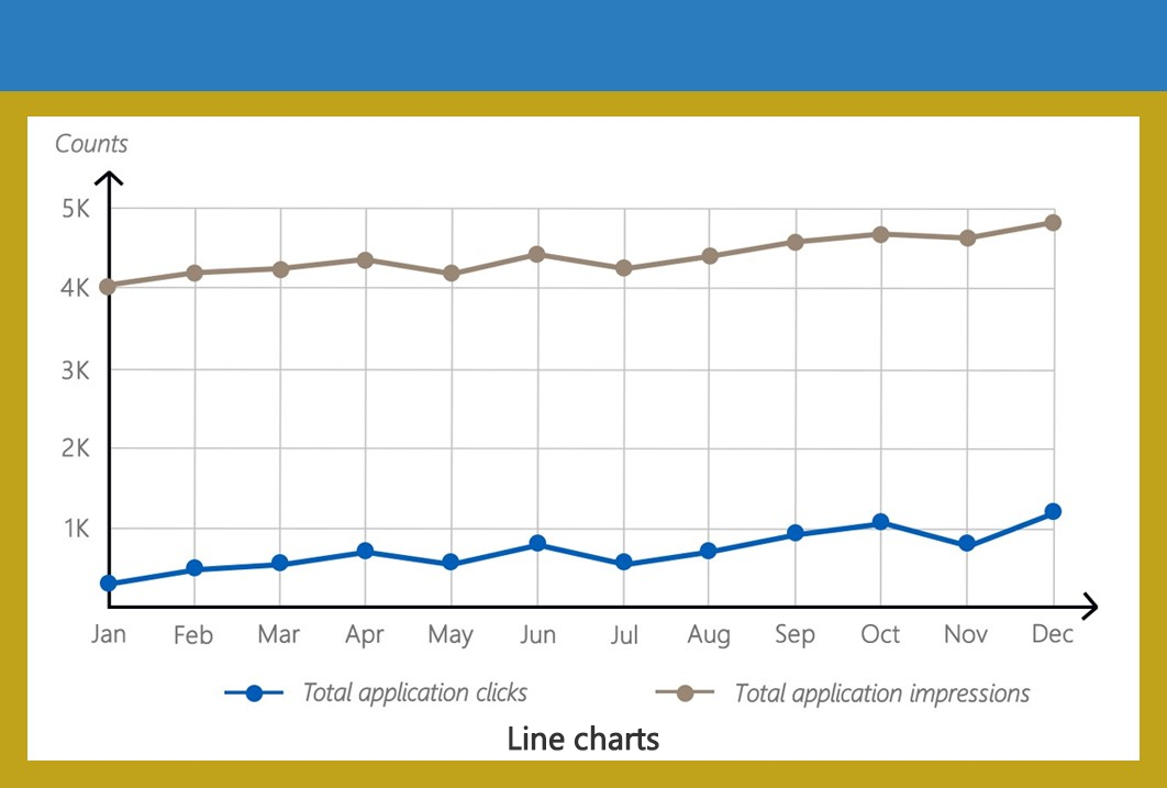
Line charts
 ×
×
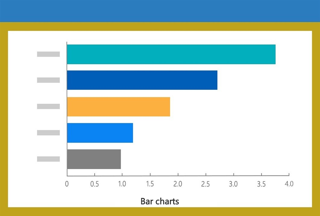
Bar charts
 ×
×
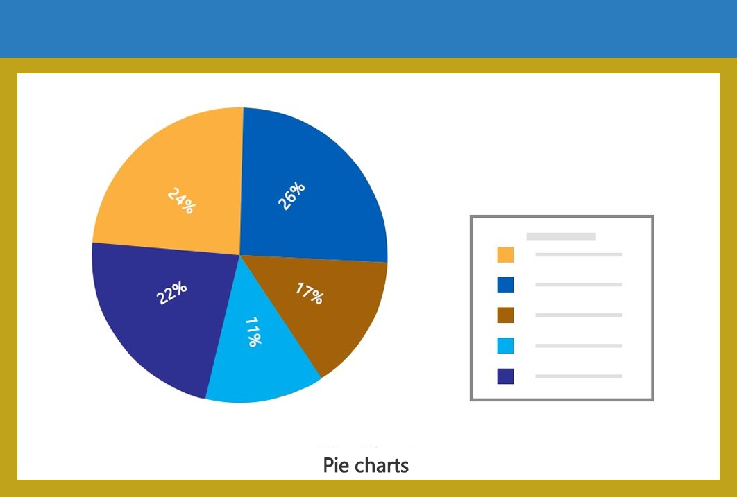
Pie charts
 ×
×
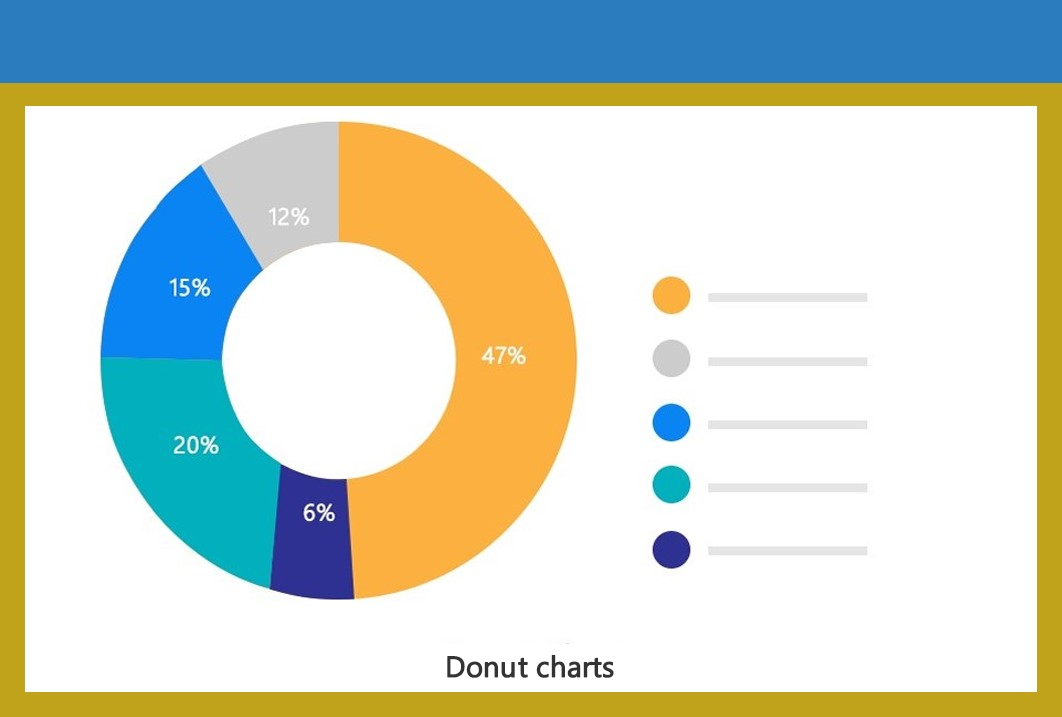
Donut charts
 ×
×
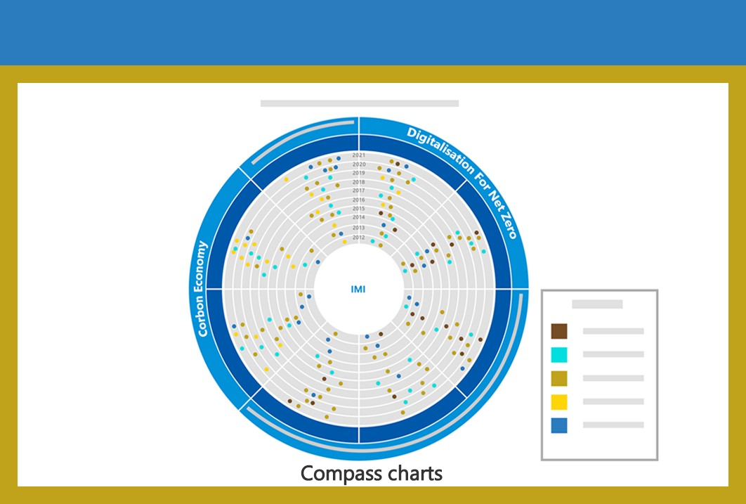
Compass charts
 ×
×
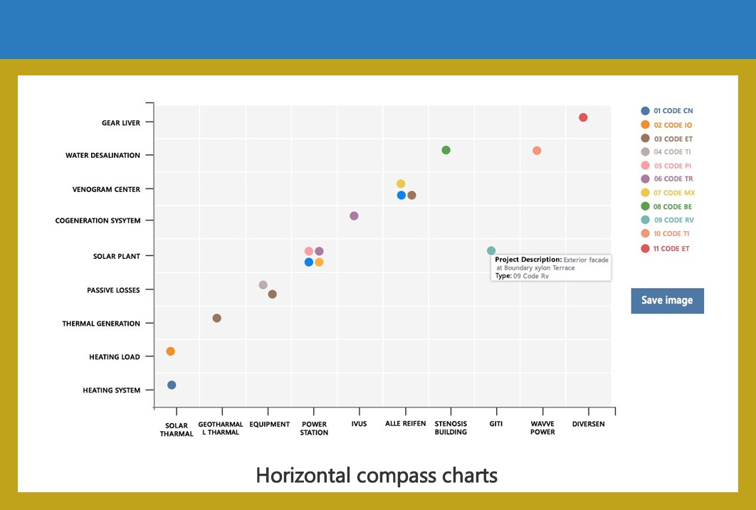
Horizontal Compass charts
 ×
×
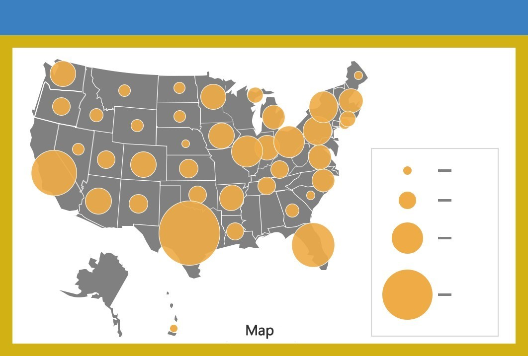
Maps
 ×
×
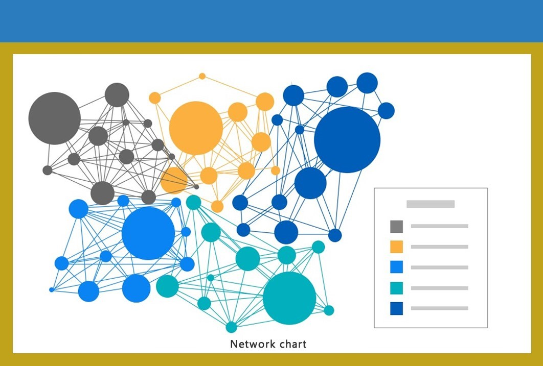
Network charts
 ×
×
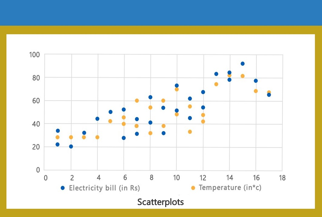
Scatterplots
 ×
×
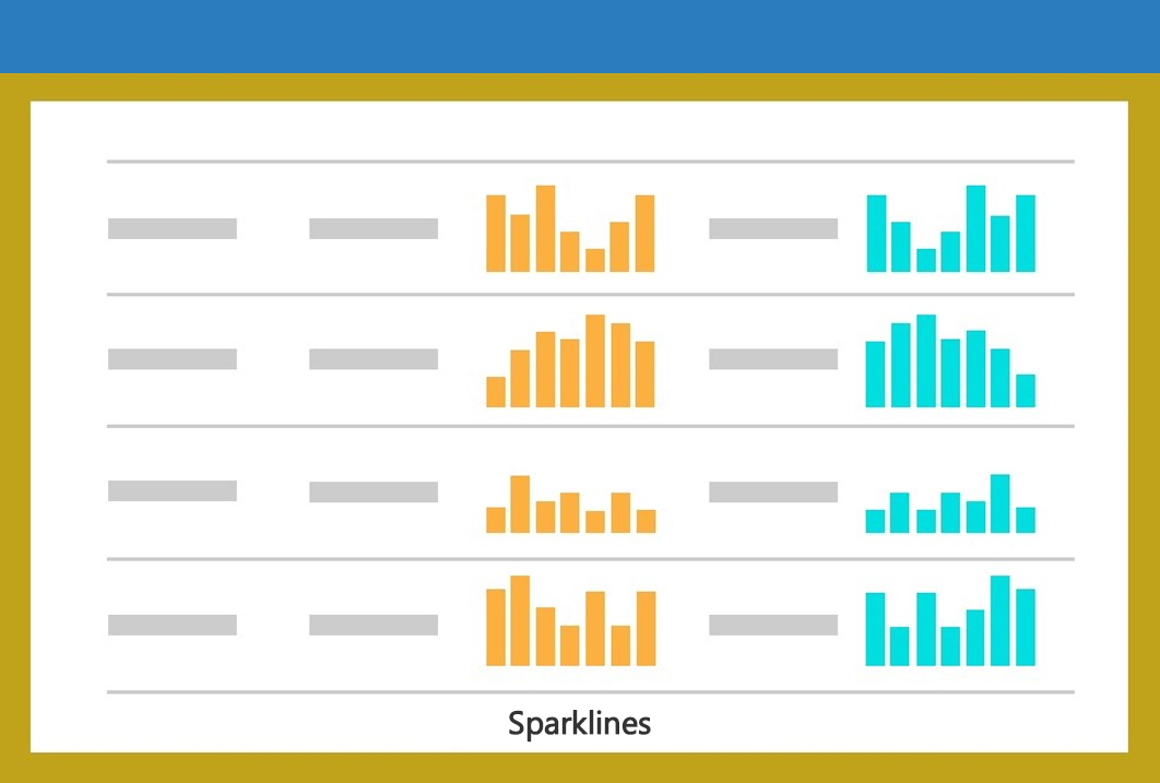
Sparklines
 ×
×
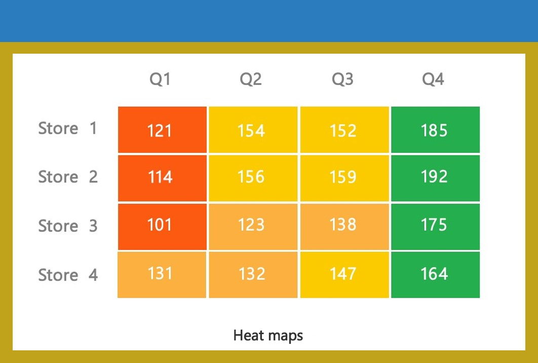
Heat maps
 ×
×
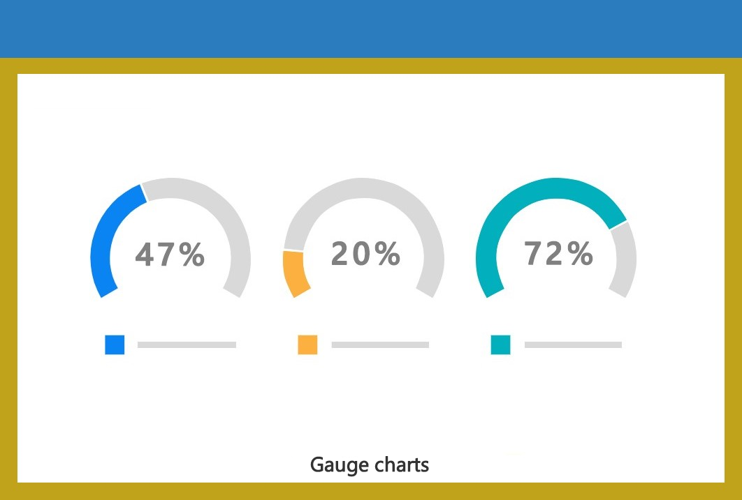
Gauge charts
 ×
×
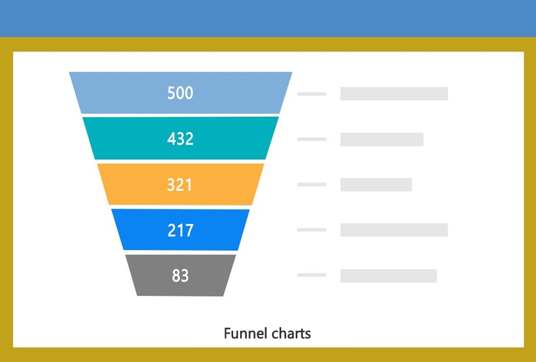
Funnel charts
 ×
×
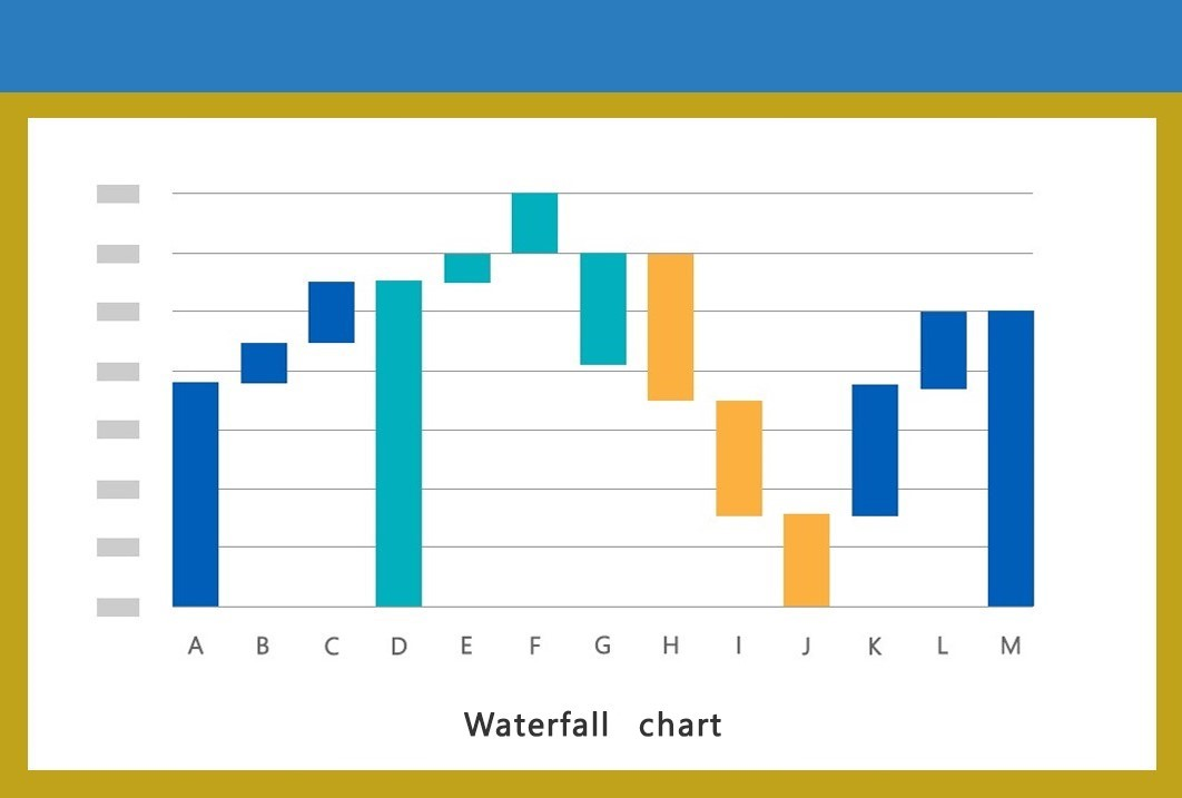
Waterfall charts
 ×
×
Custom charts
 ×
×
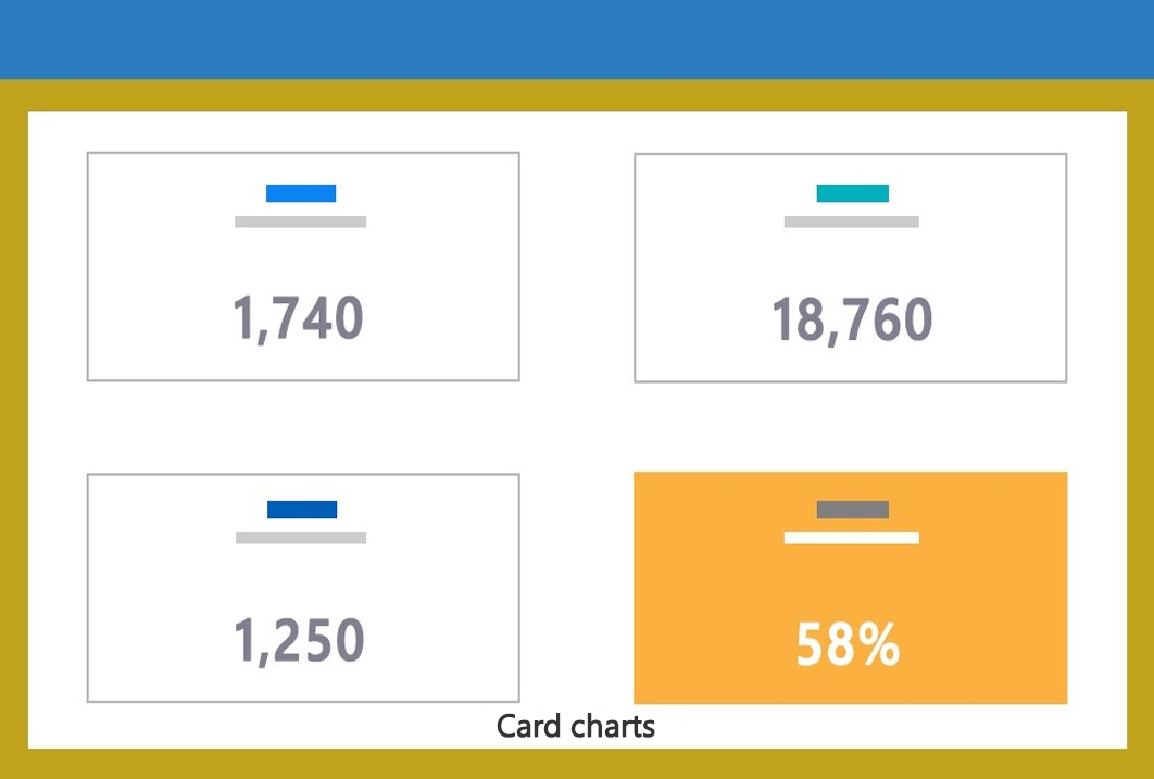
Card charts
Technologies We Use
Data Visualization
EezahTech specializes in configuring Power BI to analyze data from diverse sources and present insights in a user-friendly format.

EezahTech has implemented D3.js to seamlessly process data from various sources and create user-friendly dashboards.

EezahTech leverages the power of Plotly.js to seamlessly process data from various sources, transforming it into visually engaging and interactive graphs and charts presented in a user-friendly format.
EezahTech harnesses the power of ogma to seamlessly display, explore, and interact with graph data within web applications, enabling the creation of interactive graph visualizations that deliver an immersive user experience.

EezahTech employs Chartist to seamlessly analyze data from sources, generating user-friendly charts and graphs that showcase patterns and trends.

Eezahtech leverages Tableau to craft a wide array of charts, graphs, maps, and dashboards, facilitating the visualization and analysis of data to support informed business decision-making.

EezahTech implements Highcharts to efficiently process data from different sources and generate interactive charts in a user-friendly format.
EezahTech leverages the power of Leaflet to seamlessly process data from various sources and craft interactive maps that deliver an immersive user experience.
 ×
×
Our Data Visualization Portfolio
We offer data visualization services so that customers may look for trends, track the accomplishment of business objectives.

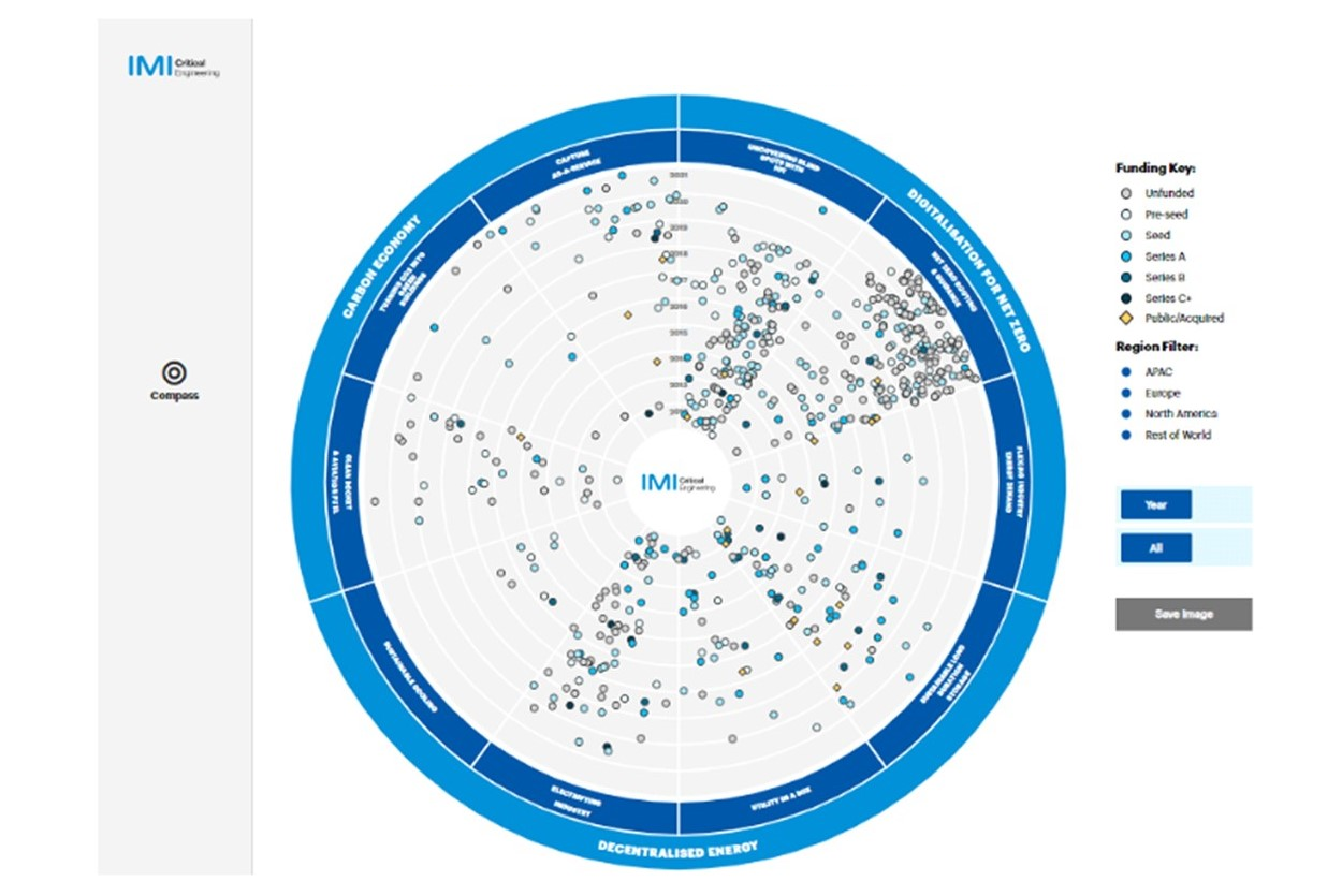
Interactive D3.js Compass: Explore Company Data and Funding
- Explore and visualize data from various companies based on their funding using an engaging D3.js compass chart.
- The chart is categorized into four main sectors: insurance, cross-business, payments, and cc&c, each with its own subcategories.
- Customize your view by selecting different regions.
- Filter the data by year, maturity level, or view all data at once. You can also highlight "hero" companies.
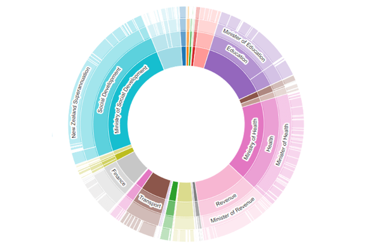
Visualize Your Budget: Explore with D3.js Sunburst Charts
- Dive into your budget analysis using interactive D3.js Sunburst Diagrams.
- Explore two key categories: expenditures and revenue.
- Select the specific year you want to examine.
- Easily distinguish results with vibrant colors for each category.
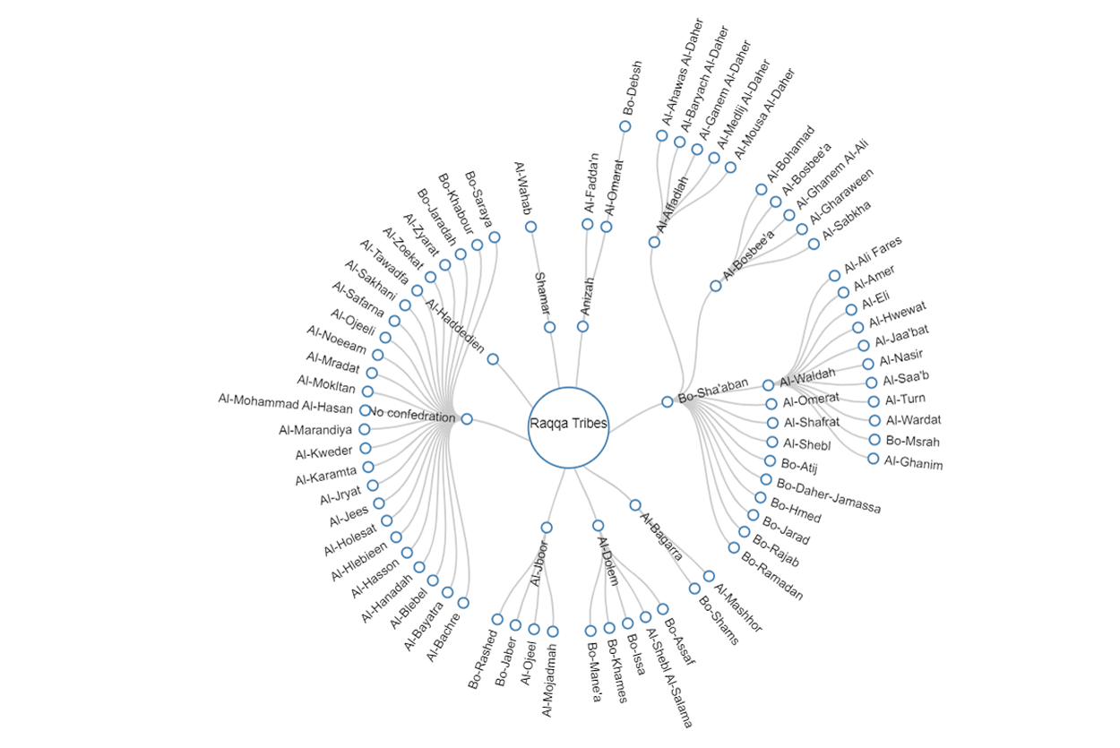
Explore Arab Tribe Relationships with Interactive D3.js Tree
- Discover the Arab tribe structure with a captivating zoomable tree visualization.
- Discover nodes with multiple branches.
- Easily collapse nodes by clicking on those with multiple branches for a clearer view.
- Hover over nodes to reveal tooltips with leader names, kinship information, and tribe size.
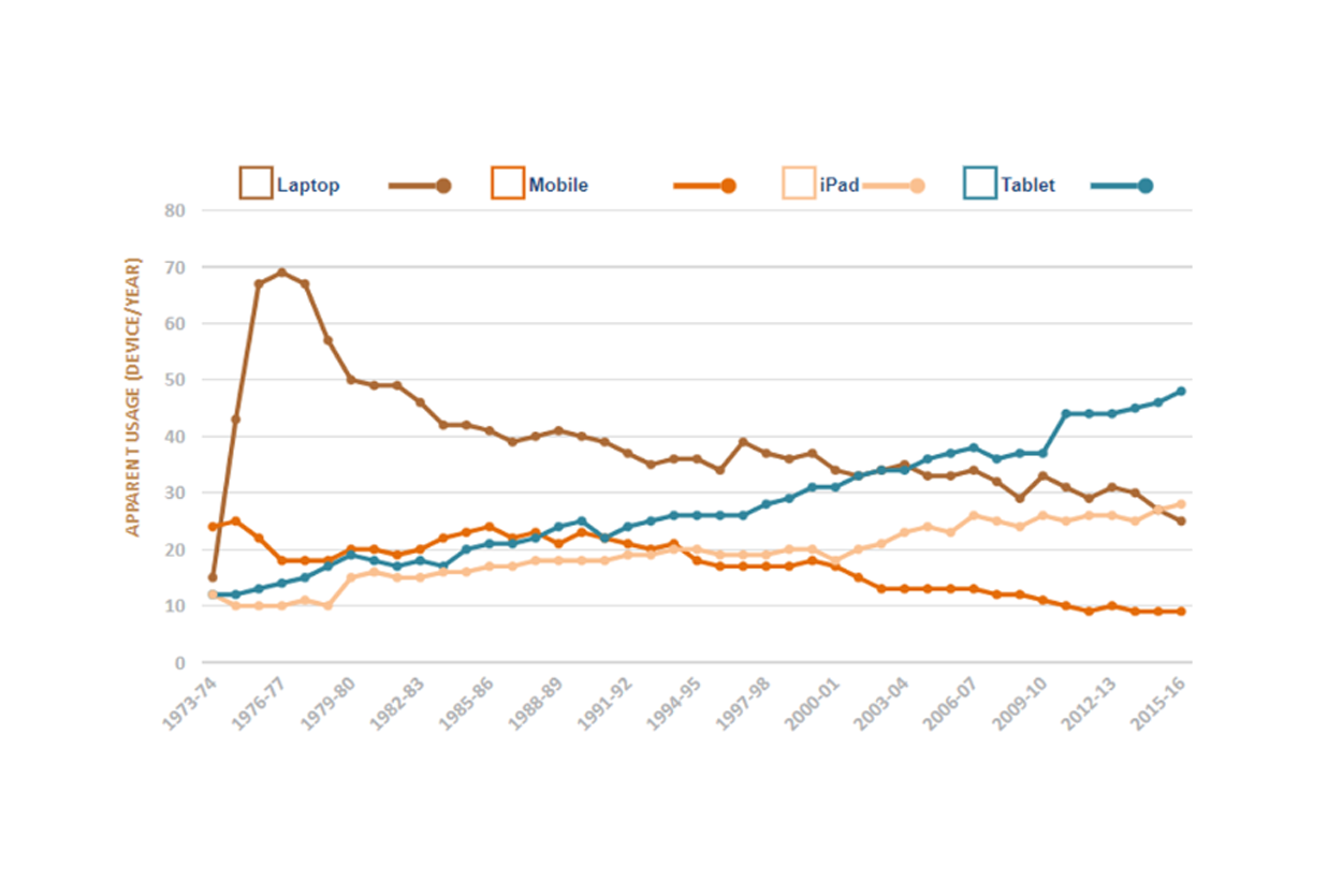
Discover Devices Trend with D3.js
- Explore trends in device usage over the years with an interactive multi-line chart.
- Easily compare the popularity of devices like laptops, iPads, mobiles, and tablets.
- Select different devices and track which one is trending currently.
- The chart displays the number of devices and the number of years, making it user-friendly.
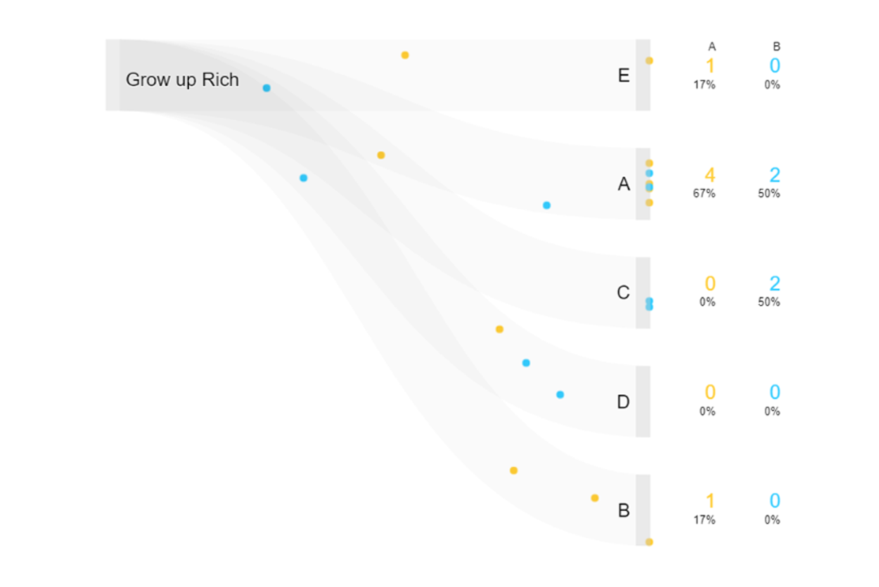
Discover Animated Sankey Chart with D3.js
- Dive into the fascinating world of family dynamics with our Animated Sankey Chart.
- Witness the journey of offspring and their evolving positions in society through engaging animations.
- Explore the intricate web of segregation and progression over time.
- Gain unique insights into the generational development of affluent families.
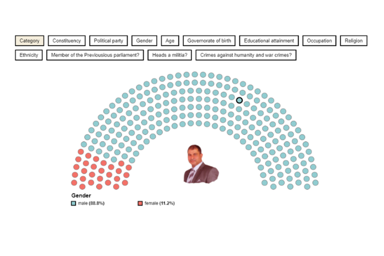
Interactive Election Candidate Data Dashboard with D3.js
- Choose a member from the list, and instantly access their information.
- View information such as name, category, constituency, political party, gender, age, and more.
- Dashboard updates based on your filter selections, showing relevant candidates.
- Get candidate details by hovering over the nodes on the dashboard.
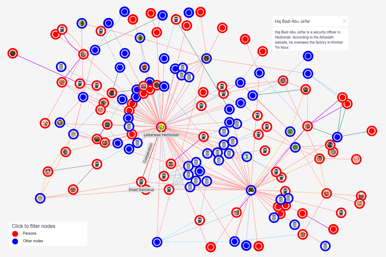
Interactive Network Map with D3.js & Ogma
- Explore a network map that visualize relationships between organizations and individuals.
- The map features red nodes for individuals and blue nodes for organizations, connected by various relationships.
- Hover over nodes to see names of individuals or organizations.
- Instantly update the map to focus on specific organizations when you select a filter.
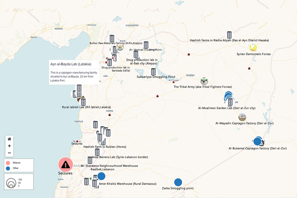
GeoMap Explorer: Discover Data Through Interactive OGMA Project
- GeoMap lets you explore and discover organizations using two main categories: seizures and narcotics.
- Select an organization to open a tooltip with detailed information, including description, criminal activity, primary data, source link, and more.
- Each category offers specific filters to refine your map view.
- Hover over an organization to see it light up on the map for easy identification with its name.
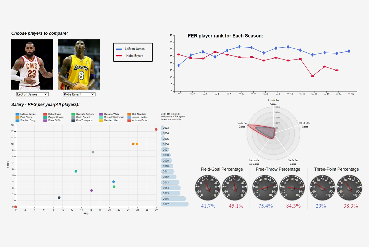
Unlocking Player Performance Insights with D3.js Dashboard
- The Dean Dashboard allows users to compare two basketball players using a visually appealing comparison graph.
- Compare player performance using a multi-line graph.
- The dashboard also features a radar graph that displays points per game, assists per game, blocks per game, and steals per game for the selected players.
- Additionally, there is a graph illustrating the relationship between points per game (ppg) and salary.
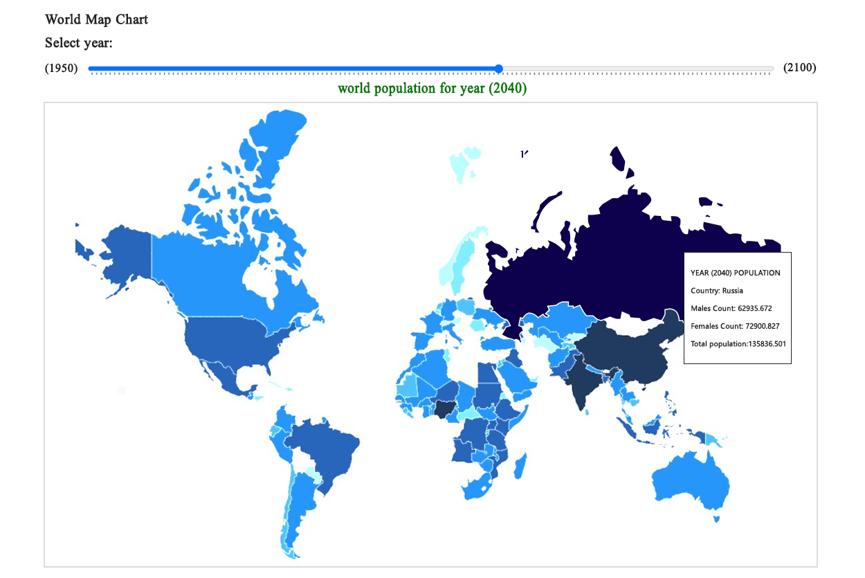
Interactive World Population Map with Slider
- The map features a slider that lets you visualize population data.
- Simply select a year from the slider to see how populations change over time.
- Watch as colors shift from light to dark, indicating changes in population density.
- Darker colors represent higher population densities.

Door light Saving Logo
- Our Door Light Saving logo is crafted using D3.js, offering an interactive experience for home buyers and sellers.
- Users can seamlessly navigate between two categories, buy and sell, each providing unique insights into home prices.
- In the sell section, users can effortlessly move the cursor to explore different home prices, traditional costs, and their potential savings, with prices dynamically adjusting as the user interacts.
- The buy section simplifies the home buying process, displaying home prices and associated cash rebates in real-time as users navigate through the interface.
- Users no longer need to perform complex calculations. As users interact with the logo, whether in the Sell or Buy section, all values are automatically calculated. This user-friendly feature simplifies the process for both buyers and sellers.

Enhancing Mutli Line Series Custom Chart.js. D3.js-Enhanced Mutli line Chart with Interactivity.
- Crafted a dynamic multi-line series custom chart with D3.js, showcasing an innovative X-axis notes container for enhanced user engagement.
- Enhanced user engagement with interactive checkboxes for impression, click, CTR, and position, enabling seamless data selection and visualization.
- Leveraged D3.js to synchronize scales with plotly.js, ensuring seamless data representation and analysis.
- Implemented hover-enabled notes for a user-friendly experience, providing users with insightful details on data points.
- Enhanced the timeline chart by dynamically adjusting scales during zoom, providing a fluid and intuitive interface for users.

Interactive Project Visualization with Year Filter
- Explore our meticulously categorized chart, Seamlessly organize projects into specific categories and subcategories, each linked to distinct project types for efficient classification.
- Tailor your exploration by selecting a specific year from a user-friendly dropdown menu, ensuring a personalized and focused view of projects over time.
- Dive deeper into project details by clicking on circles, revealing tooltips with concise yet comprehensive project descriptions and associated project types.
- Enhance your research efficiency by saving the dynamically customized graph with a simple click of the "Save Image" button, streamlining your project analysis process.
